Be Inspired by Creative Director Erin Cummings - Webonise Weekly Design

Please check out the original article here: http://www.webonise.com/be-inspired-by-creative-director-erin-cummings-webonise-weekly-design/
------------
Our Creative Director - Erin Cummings, steals the scene! Here’s her list of design inspirations as she spearheads our team of creatives. Notice anything? Yup! She loves cars and it definitely showed through in this list.
Inspiration is truly a matter of perspective! Satisfy your thirst for design, keep your creative juices flowing and immerse yourself into this week's impressively vibrant inspiration resource.
Porsche by Design

At an exhibition called Porsche by Design, I found myself absorbed in the shapes and colors of Porsche through the years. It was impressive to see how the cars and concepts changed over time and how they were all different yet all had the essence and continuity of Porsche, especially in those iconic headlights.
Find it here: Porsche by Design
Have Fun With Advertising
This ad is a bit old now, but it is one of the most brilliant commercials I have seen as of late. I believe this is the work of JWT NYC – It's unconventional, attention grabbing and fun. I would have loved to sit in on this pitch meeting.
Find it here: Southern Comfort | Karate | Whatever's Comfortable on Youtube
An Unusual Pair

I like to make a connection between food and design creativity. One thing that struck me recently is the juxtaposition between two things I didn’t think could go together. On a recent New York trip I stumbled upon Otto, Mario Bitali’s pizzeria. I was intrigued by the truffle honey, a combo that seemed to be a challenging pairing, to me. Boy, was I wrong. They compliment each other so well. Goes to show that you never know when something will work out until you put them next to each other. I find this concept in my work all the time. I have to remind myself to at least try an idea on the art board before dismissing the odd pair all together.
The Art World

I started following Leon “Tes One” Bedore a few years ago, while I was still a young designer in Tampa. I have always loved his use of color and layering that he brings to his work.
Find it here: Tes One
Fun and Appropriate UI

This site was passed along by a fellow Webonise colleague, and I just love everything about it. The UI and UX are very appropriate for the content and demographic. It’s innovate, fun and intuitive. Not to mention I have a love of street art.
Find it here: Street Art on Google
Print Done Right
This print work from Dessein is just beautifully executed! This work wonderfully blends themes with a great balance of negative space and texture elements. It really makes me want to get back into poster design.
Find it here: Dessein Blog
“Archimusic”

Sometimes I’m flipping through flip board late at night and come across someone doing something fun and new. This artist took the creative license to turn a musician’s sound and essence into a visual representation in building form. Cool stuff.
Find it here: Archimusic Posters by Federico Babina
The Unlikely Marriage of Gulf Colors

I have followed the Lemans series for a few years. There is nothing like watching the brake rotors glow on turn 10 at Sebring. One thing that has always drew my eyes was the Gulf color scheme; two unlikely colors that seem to go so well together, there had to be a story… Turns out there was! I have always pushed for unusual color schemes and its nice to see it in practice in such an effective way.
Find it here: Modular4kc.com
Illustration to the max
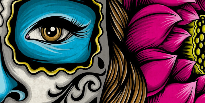
I’ve been following Palehorse for several years now. I was so thrilled to see him get some exposure in doing murals in the city of St. Petersburg. The work is very unique. It is detailed, time consuming and you can tell the guy is a projectionist. Although some of the work might be controversial, I am inspired by art that pushes the boundaries no matter what.
Freshen Up
There comes a time in nearly every logo's life where you have to think, “Should we freshen this up?”
It’s true for almost every brand. Recently Airbnb re-launched their new branding after having many design agencies bid on the job. I think getting away from their instagram-like start up look was a good move. The new branding represents the brand brilliantly in a simple way. I think this logo will work for them for years to come. This article about the branding change is very interesting. I tend to agree with the author about the “method” process but for this brand it worked and they came out with something great.
Find it here: Underconsideration.com _________________________________________________________________
Erin Cummings – Creative Director
“Simple is hard.”
How long has it been…ah, about two years now since I started with Webonise back in the summer of 2012. It feels like it was so long ago!
Since then I have pushed a lot of pixels around, and we have made some very cool products. In my current position, I love working with my team and being a mentor to junior designers, as well as coming up with new and creative ways of problem solving with UX and design. Working with me you will find that I am straightforward and assertive; creating beautiful products is important to me. Aside from all that I love beer, antique motorcycles and traveling.
Design Theme: Keep it clean.
Design Rule: Make it striking, make sure it works and most importantly learn how to edit.
Follow Me:
https://www.behance.net/erineliz99
http://www.erineliz99.com/
https://www.linkedin.com/pub/erin-cummings/8/388/605