
Onboarding Shutterstock consumer app
Shutterstock’s consumer application had a problem: upon download users didn’t know what the app was about NOR have the ability to login.
Well, we decided to fix that.
Read the problem and solution we came up with. This is now live on iOS and soon will be available on Android as well.
Shutterstock consumer app Onboarding

Shutterstock is a two sided market place for selling and buying photos. The project detailed here is for our consumer application where images are purchased.
The problem
First time users of the apps get confused about:
“Royalty free” means
Why is there a watermark
Being thrown into customer experience without any foundational knowledge
Users expect an easy way to get into their account
Users expect the experience to be seamless
Contributors downloading the customer app and trying to log in (there is another app for contributors, not the consumer app)
Over 60% of our users do not (or never) login
Success measures
Increase in Sign ups / Log in for a first time user
Less disgruntled customers complaining in the app store reviews
Increased activity on Contributor Log in button (creating less confusion)
The solution
Our solution was a multi pronged approach but here I will just detail the on-boarding carousel and log in / join screen updates we took on.
The illustration below shows visually that this carousel is only one part of the on-boarding process in educating users to the value of the Shutterstock app.
We realize that a carousel is very easily skippable and people might not read but it is crucial to introduce users to the brand.
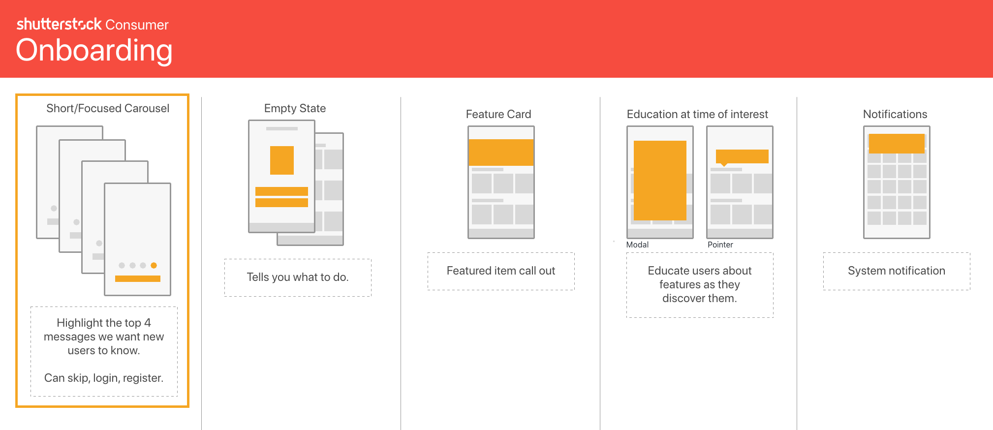
This onboarding carousel is just a single piece in the onboarding experience that we are planning to roll out.
From the onset of the project we had discussed adding video to the background of the carousel. We did this for 2 reasons:
It is visually more engaging
It will also hint to the great video products you can purchase on the Shutterstock app
To execute this I brought the video clips into Adobe Premiere and created the video based on 4 second transitions then I asked the developers to auto advance the text sliders to sync with the video behind it.
At any time the user can swipe back and forth to re-read the copy and the video will just continue playing behind. This way the video is not a distraction while interacting with the page.

Editing the video to size to work on multiple device screen sizes.
Before: drops user into the app and gives no context on what the app is about.
After: The carousel prepares the user for what the brand and product is about. This is the final version in production.
As a part of this I realized that we had to update the login and sign up pages otherwise it felt like a broken experience in that the user would go from this beautiful page into a dated form. Therefore we also updated those screens.

Here is a peek at some of the documentation for the forms.


The result
iOS was deployed in October and Android in December. Neither had any sign up capabilities prior to this release.
Signup events for iOS is now around 2500 every week and Android is 5300 every week.